Case Study #1
Health Hub Mobile app Design
I challenged myself to work independently, too design an app to support wellness and activity.
8/2020 - From start to finish this project took only 5 weeks. Starting from July 20th and completed by August 21st 2020
My Role
To research and design as well as test and understand the goal that needed to be achieved for potential users.
Project Summary
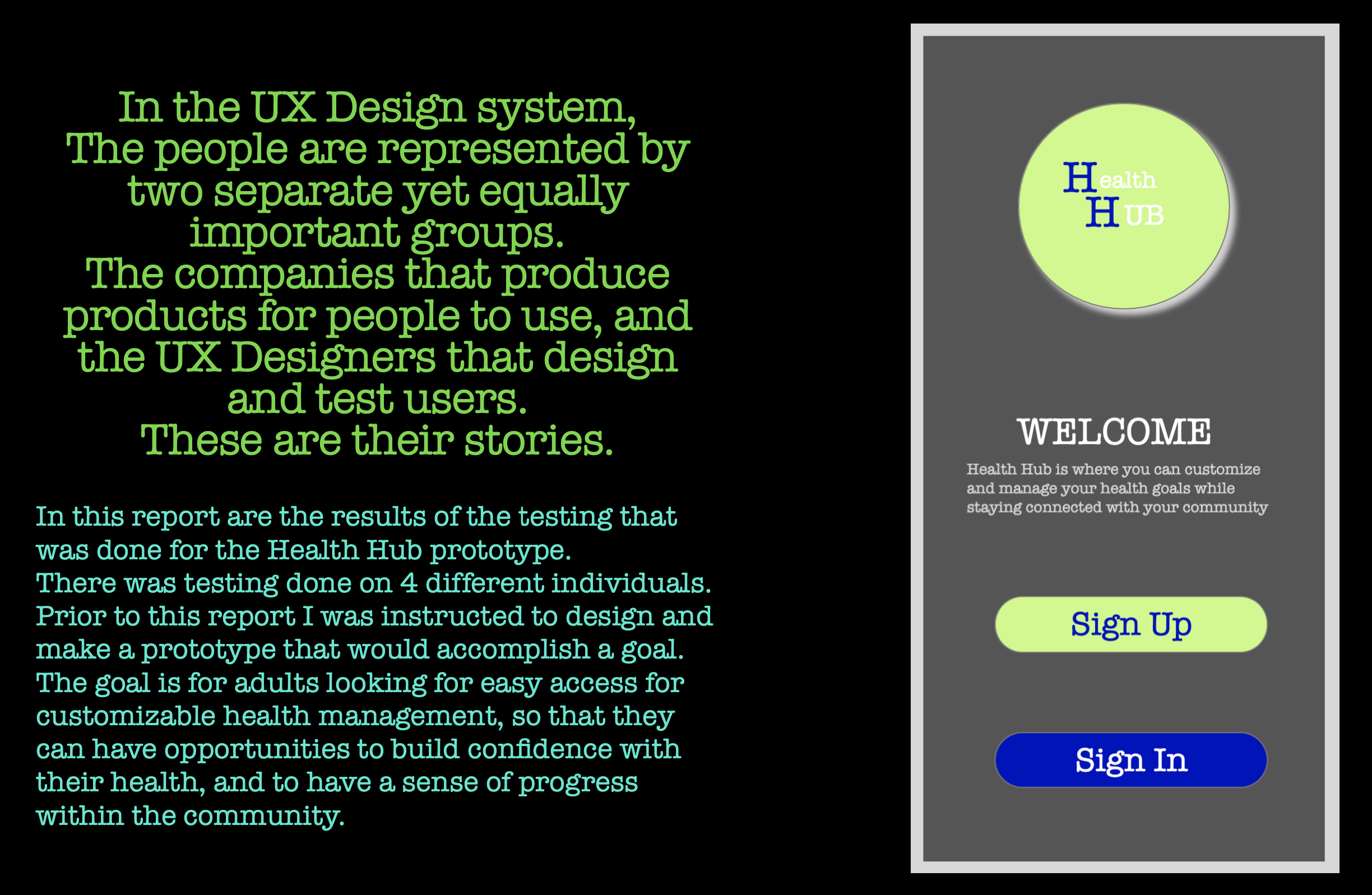
The project was to design an app for wellness and activity. I conducted interviews to arrive at a goal for the users. The goal is: adults looking for easy access for customizable health management, so that they can have opportunities to build confidence with their health, and to have a sense of progress within the community. I drew up some sketches and made digital wireframes. From there I made a hierarchy diagram of the wire frames. Then I made a prototype in Axure, which brought me to do some scenario-led user testing of the prototype. I found some pain points and I also uncovered that a good part of the design was intuitive. I wrote a think aloud report explaining my findings and what I uncovered and some solutions to the pain points I found.
The challenge/problem
For an app that is focusing on health and wellness my idea for the capabilities of this app were great. Narrowing down my focus was something I found difficult. My main focus was to have the users experience a happy path.

Digital Wireframes
I made these digital wireframes in Sketch to show how my design correlates with the user goal.
the five prototype screens below (reading from right to left) are in the order as the user went through the steps with the exception that they did not click “add more”.


The solution
The scenario - led testing brought up a lot of information. As you can see in the section above I show you the screens the user saw. The last picture is my sketch of a solution for the pain points the participants experienced. Although this prototype is a small part of a larger picture, I was able to complete the user goal through that user flow process.

Redesign
The last screen is a sketch of my process of fixing the pain points here. I removed the plus symbols to further clarify that you click on the activity. I added a section of an example of one of the actions clicked because all of the participants said something to the effect of having an activity “main page”. The arrows indicate clicking on the selection to show the path the user would see when making those selections.
“Seems pretty simple, most of the pages are straight forward about what you do. -Stacey”
Results
Overall the prototype was a success. All the users were able to understand what the app was for. It was clear as to what they needed to do. Throughout my user testing I found that thinking out loud is something that is hard to do. I was able to get a sense of direction with the results as to how to move forward with the design.